Embrace the Chaos
Most of the approaches taken toward creating digital comics so far fail to take advantage of the medium. In trying to adapt the known experience of printed comics for a screen, artists design comics layouts as if they were still designing for a static, one-size page. The metaphor of the page is a tough one to break—we've been living with it for 500 years. But a screen—or rather, a continuum of screens—has very different characteristics from a printed page in a book.
The printed page is immutable, and fixed in size. It is also static. An individual screen on a particular reader's device is also immutable and fixed in size, but it's not static, and this is the place where most comics are playing these days—taking advantage of the internal fluidity of the screen to do things like displaying an infinite canvas, light interaction and animations, superimposing panel states to depict action over time, to name a few examples—but always within the context of a fixed viewport size. Creating comics for individual viewports imposes a new set of limitations: storytellers end up designing page layouts for, say, an iPad, a Kindle Fire, or another, arbitrary screen size defined by a single target platform. But this approach isn't scalable: any comic created this way will always be bespoke to a particular screen—or more accurately, viewport size, to use web design parlance.

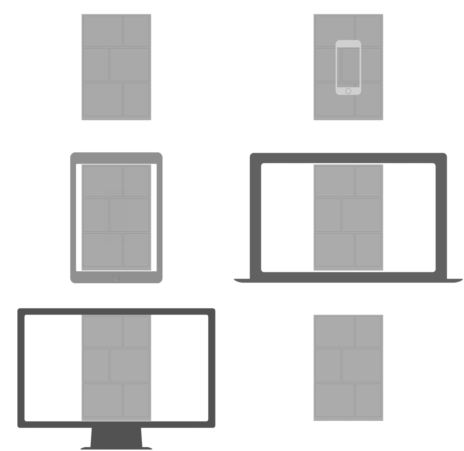
A static page, shoved into fluid multitudes.
The reality of screens is that they're not one, immutable thing—screens have unique characteristics that are different from printed, paper pages. When designing for screens, we've discovered that screens are fluid surfaces, and the way we design content for them must change accordingly.
More crucially, as the general web design community has discovered, targeting one screen size or another is a losing game of whack-a-mole. Instead of focusing on one layout or one device, we should be designing systems that can be displayed across a multitude of viewing conditions.
Unique attributes of a digital comic
A networked, screen-based comic has some very different characteristics from the printed page.
Viewport variance
In print, one of the major constraints is the size of the paper on which we’re printing. A six- by nine-inch printed comic is always six inches by nine inches, no matter what. These static dimensions define the bounds of our viewing surface as a unit of storytelling, too; the visual storyteller must conform their layout to the confines of that printed page.
Devices for viewing the web, on the other hand, run the gamut of possible sizes: from tiny handheld devices to full-sized tablets, and, increasingly, large-format displays that I like to call “digital broadsides.” On the open web, it's almost impossible for the designer to predict what the viewport size will be when a reader loads up a “page” on their device. This calls for a storyteller to create fluid, responsive layouts that adapt to varied and often unpredictable screen sizes.
Viewing conditions
In the same way that the web has a myriad display surfaces, it also has an unknowable number of viewing conditions. Bandwidth, language, and screen resolution are just a few of the variables that designers on the web need to take into account.
A reader could be viewing a site on a high-resolution iPad, pulling it in through a high-bandwidth connection in Hong Kong; on the “experimental” web browser on their black-and-white Kindle, in rural Mexico; or on a small, low-resolution Android phone in New York.
Responsible designers need to take this variance into account and create content that can adapt to these unpredictable variables as gracefully as possible.
Some drawbacks of current approaches
Most of the current approaches to digital comics out there share a few key shortcomings:
The static page metaphor
Both methods of making digital comics described earlier still cling to the metaphor of the static, fixed-dimension page as a framework for designing, displaying, and consuming comics on a screen, which means always working within a static, fixed dimension viewport, either inside a web browser or in an app.
The comics created in this way are mostly designed with a specific page dimension in mind—usually six by nine inches, the size of an American print comic. While creating for a known, fixed canvas size can certainly be convenient, especially when repurposing the digital comic for a print run, it can be an awkward fit when reading on digital devices.
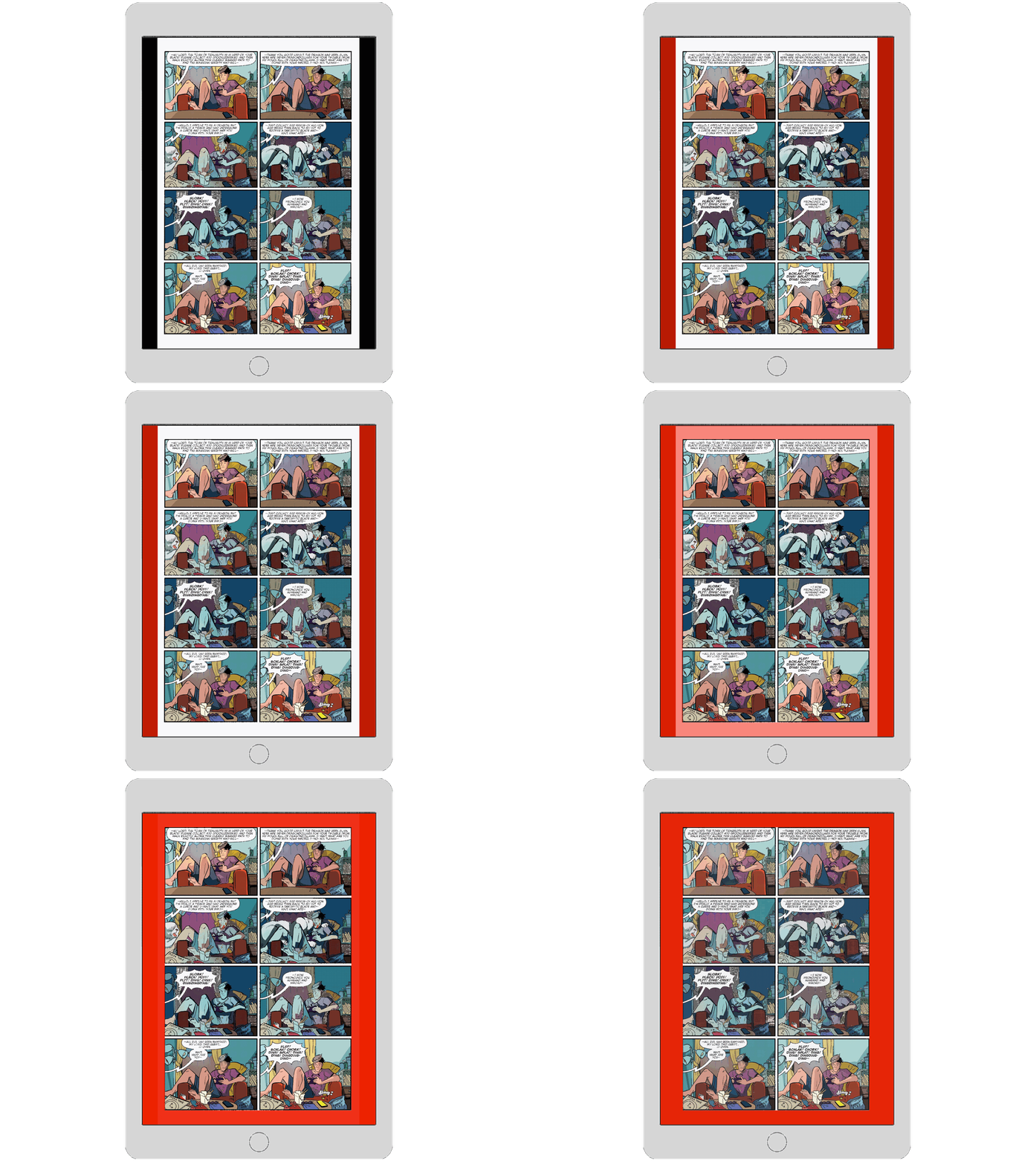
For example, when viewing full-page comics created for a six- by nine-inch page on an iPad Air, the sides of the device's screen are effectively wasted, creating an odd “lateral letterboxing” effect which underscores the fact that the comic has been awkwardly adapted to fit the viewport.

The iPad Floppy Fiasco: the lateral letterboxing and extra margins in comics adapted from print get in the way of an immersive reading experience.
Undermining page-level storytelling
Panel-by-panel presentations of digital comics, like ComiXology's Guided View, often undermine one of the fundamental (yet sometimes overlooked) aspects of sequential art, and arguably one of the attributes that makes a comic, a comic: the use of a full-page layout design to create a visual rhythm that reinforces the narrative being depicted from panel to panel.
The fundamental unit of storytelling in comics is the full-page layout, not the individual panel. The magic of comics happens in the gestalt of the visual juxtaposition of multiple panels. Otherwise, you just have a series of related images, presented to the reader in order over time. The comics reader usually takes in the gestalt of a page, and then starts reading panels in sequence. Designing the page layout, determining panel sizes in relation to each other, using a color theme to reinforce narrative rhythm, are all page-level techniques that the comics storyteller employs as a way to support their narrative. The best comics storytellers understand the importance of presenting a panel in context, and work in what Paul Duffield calls “comics mode”:
Comics live in the expressive, representative and symbolic nature of a drawing, in the comic page when treated as an interconnected piece of art, in the reader’s ability to “pause”, “rewind”, “rewatch” and linger on a moment at their hearts content. Comics thrive when each panel doesn’t just represent a mechanical shot-by-shot advancing of the plot, but a carefully considered and timed “beat” which enforces an emotion, underlines a joke or teases out a dramatic moment. Comics excel when the artist understands how to guide the reader’s eye around the page, when a layout does more than frame a sequence of images, when the story is expressed non-photographically and when the qualities of the artwork beam the characters’ emotional states right into the reader’s head before they read a word of dialogue.
For example, using Guided View for reading a page from Matt Fraction and David Aja’s excellent Hawkeye gets the job done.

In comics, the gestalt of the page is grester than the sum of its constituent panels.
But readers are missing out—there's a rhythm to a page on Hawkeye, and Aja and Fraction have worked to guide the reader’s eye through the sequence of panels in a particular order. The size and placement of the panels in relation to each other works almost subliminally to convey an emotional state to the reader, and the reader needs to do the work of parsing the page* as it has been designed by the storyteller in order to fully appreciate the tone of the story.
Nowadays, high-resolution tablets like the Retina iPad Air make viewing a print comic as a series of consecutive panels unnecessary, since the screen is large enough and sharp enough to legibly render a full-page print comic. While techniques like Guided View continues to be useful in adapting printed comics to small-screened devices, we need a better solution for building digital-native comics to small screens, one that doesn’t undermine a crucial aspect of comics storytelling.
Un-semantic blobs
Both these methods also rely on compound, raster image files for presentation. Each page (or each state of a page, in the case of the Balak framework) is a discrete raster image file. Image file formats are for the most part flat and lack any semantic information, what developers call a “blob”: you can’t tell what the content of a JPG file is from looking at its data, and neither can a robot or a database or a translator. Additionally, these types of files are usually larger than their semantic alternatives. That means that they take longer to download, especially on slow or metered connections.
Relying on print-centric conventions
Presenting comics in a digital format includes possibilities and limitations that are distinct from print. Relatedly, some of the ways in which print excels don’t translate well into digital. We need to figure out what to keep from print, but we need to also realize what to leave behind.
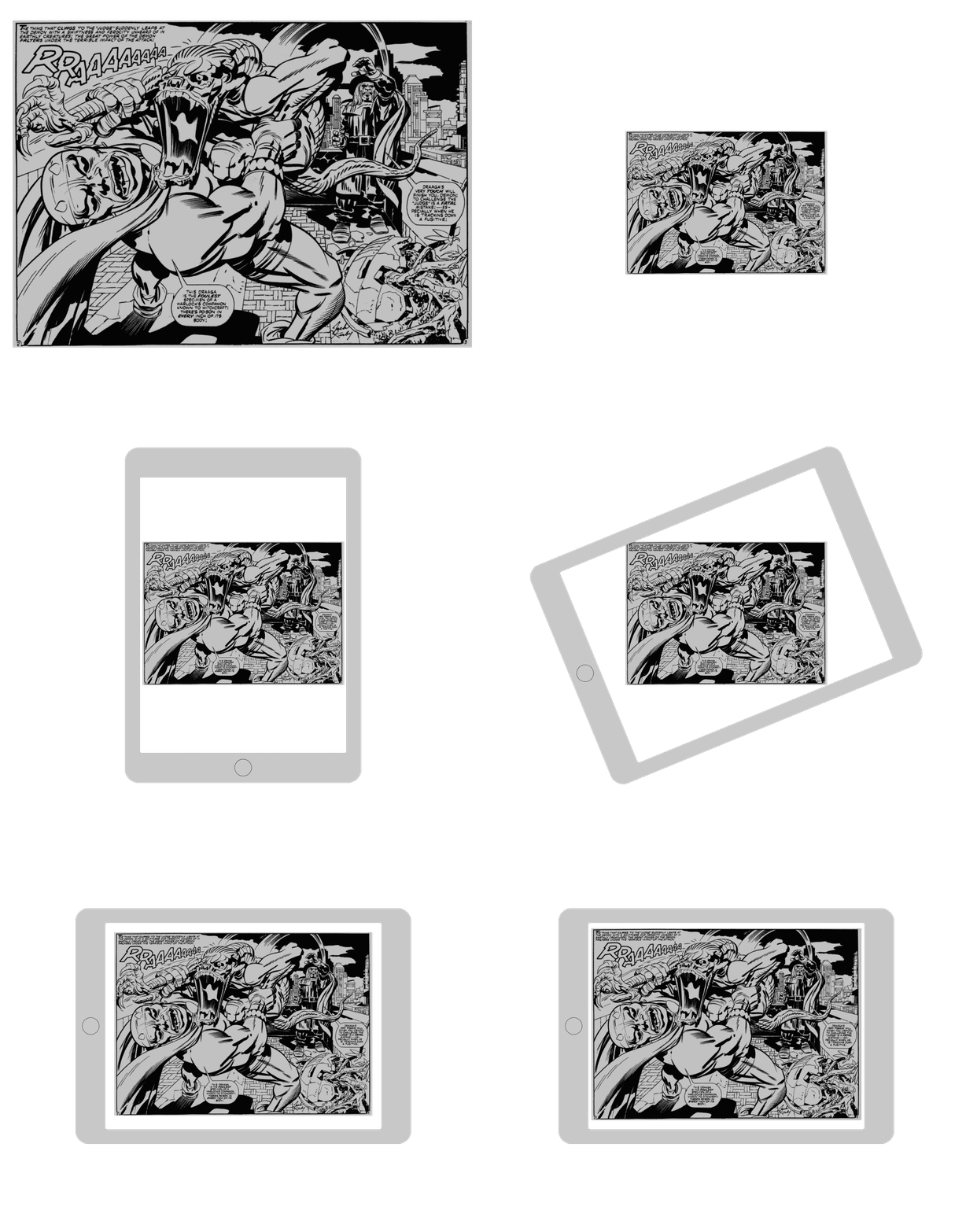
To give just one example: printed comics can use a double-page spread to wonderful effect. It allows the artist a larger canvas on which to experiment with dynamic, unorthodox layouts, or it gives them a chance to insert an epic panorama into the clipped rhythm of a panel-by-panel narrative, in order to showcase a big reveal, or provide an emotional release in the narrative arc of a story.

A double page spread turns from an immersive device on print into a bit of friction on a tablet
But on the iPad, for example, double-page spreads become a nuisance, rather than an enhancement: the reader has to flip their tablet into landscape mode to see the spread at a legible size, and even then, it’s still smaller than the previous page, since the proportions of the artwork designed for the printed page are different from the proportions of the reader’s screen.
As a result, the reader ends up with an experience that is the exact opposite of what the creator intended: the double-page spread feels smaller and more cramped, rather than bigger and more expansive. Something that works to surprise and delight the reader in print becomes a point of fiction and frustration to the digital reader on a tablet.